Brainfart: A skinners tale

Sunday, September 18, 2005

Busy weekend?

Wow, it's been a busy weekend. I seem to skin the most when I'm sick, and this weekend unveiled a massive kidney-stone attack. At 29 years old, this shouldn't even be happening, but it's a pain that's unrivaled. Tried to be productive, however.

In brief, Singularity now has a working taskbar, albeit basic, some of the graphics blitted to the screen via LayerCuts, and a functional VWM using RabidVWM. Here are the details:

Taskbar Setting up xTaskbar requires more parameters than any other module I've ever set up, but the degree of control is truly impressive. I daresay I'll not use another taskbar module. It's got so much control over each button state (normal, active, minimized, hover, group, and flash). Once I grouped all the parameters together according to my scheme in the previous blog, it becomes a lot easier to deal with. Here's an example of the Active button state:
;----Active button state----
;tasks1ButtonBorderMethod .none

;tasks1ButtonAlphaTransparency 255

;tasks1ButtonTrueTransparent
tasks1ActiveButtonImage $LSimagefolder$taskbtn2.png
tasks1ActiveButtonImageLeftEdge 34
tasks1ActiveButtonImageRightEdge 1
tasks1ActiveButtonImageTopEdge 0
tasks1ActiveButtonImageBottomEdge 0
tasks1ActiveButtonImageMode
tile-horizontal

;tasks1ButtonSaturationIntensity 255

;tasks1ButtonHueIntensity 0

;tasks1ButtonHueColor ffffff

tasks1ActiveIconX 4

tasks1ActiveIconY 4

tasks1ActiveIconSize 24

tasks1ActiveIconSaturationIntensity 255

tasks1ActiveIconHueIntensity 0

tasks1ActiveIconHueColor ffffff

tasks1ActiveFont Arial

tasks1ActiveFontSmoothing

tasks1ActiveFontHeight 14

tasks1ActiveFontLeftBorder 34

tasks1ActiveFontTopBorder 4

tasks1ActiveFontBottomBorder 10

tasks1ActiveFontColor ffffff

tasks1ActiveFontBold

tasks1ActiveFontItalic false

tasks1ActiveFontUnderline false

tasks1ActiveFontShadow

tasks1ActiveFontShadowColor 444444

tasks1ActiveFontShadowX 1

tasks1ActiveFontShadowY 1

;tasks1ActiveFontOutline

;tasks1ActiveFontOutlineColor 555555

;tasks1ActiveFontNoEllipsis false

tasks1ActiveFontAlign left

tasks1ActiveFontVertAlign center


Something else that's becoming entertaining is that xTaskbar permits multiple taskbars. In the above example, you can see that each line is preceded by tasks1.This means I can fulfill my vision of having 3 taskbar types that the user can select between on-the-fly. The first version I implemented has 24x24 icons and text, the next will just be 32x32 icons, and perhaps a final version just showing 24x24 icons.

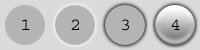
The hardest part of setting up the taskbar was getting the graphics set right. Below are two graphics, the first corresponding to the normal button state and the second to the active button state:
To give each kind of a "chiselled" appearance, I used a Photoshop layer which was set to the "overlay" blending method and 25-50% opacity and drew a white vertical line along the left edge of each graphic, and a black line against the right. This meant that to complete the look, a similar dark line must be drawn on the graphic that will appear immediately to the left of the taskbar, and a similar white line must be drawn on the end-part of the taskbar background graphic. Took a bit to decide where the lines should be positioned to maximize the effect with the minimum of effort. Ended up being the long way after all.

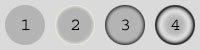
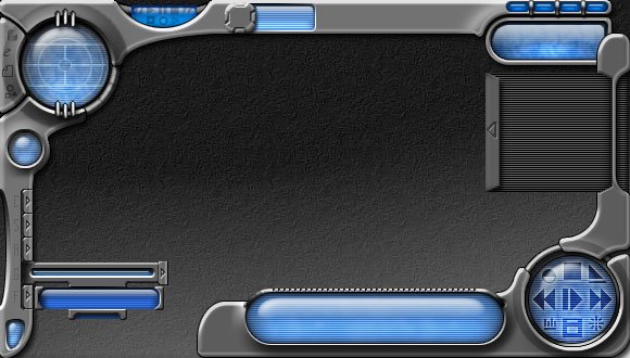
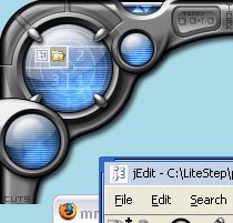
Here's what the current taskbar actually looks like when implemented:

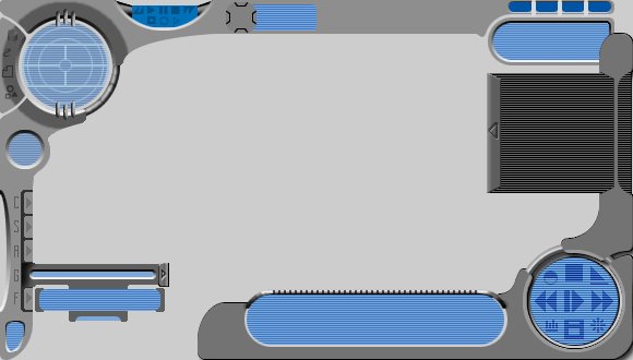
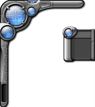
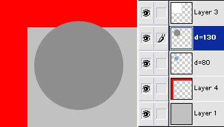
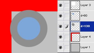
Graphic shortcuts using LayerCuts Started carving up graphics from the Photoshop file into PNG images with AlphaTransparency to start plunking graphics onto the desktop. My next blog will probably be a review of the techniques I use to slice the images. I should also mention that although LayerCuts is a shortcut module, not all of the graphics I'm sticking on the desktop are active buttons. There are quite a few I'm using just as graphics; this is a common method with many graphically-rich themes. Some will eventually become buttons, but there are some just to look pretty and provide visual continuity between the buttons. The graphics below are non-functional types inserted just to provide drop-shadows and fill in graphics between the buttons:
*shortcut "ac1":ac1 175 34 ac1.png .none .none #1 a:255 .none .none .none
*shortcut "ac2":ac2 141 34 ac2.png .none .none #1 a:255 .none .none .none
*shortcut "ac3":ac3 91 18 ac3.bmp .none .none #1 a:255 .none .none .none
*shortcut "ac4":ac4 102 62 ac4.png .none .none #1 a:255 .none .none .none
*shortcut "ac5":ac5 91 81 ac5.png .none .none #1 a:255 .none .none .none
*shortcut "ac6":ac6 58 101 ac6.png .none .none #1 a:255 .none .none .none
*shortcut "ac7":ac7 0 156 ac7.png .none .none #1 a:255 .none .none .none

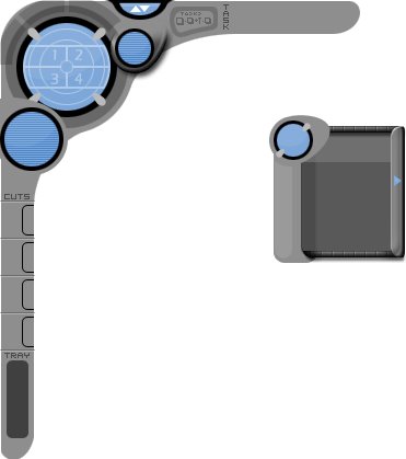
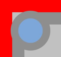
These are just non-functional shortcuts used as eye-candy. Just wanted to see how things are going to look in relation to one another on the screen. Here's how they look altogether:

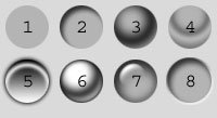
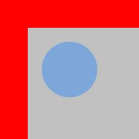
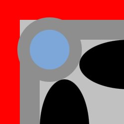
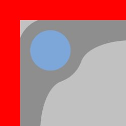
Setting up RabidVWM The center of that largest sphere will be the VWM, 4 virtual desktops presented in a square configuration. Many themers use the same graphic tiled to represent each desktop, but that won't float in this theme because the VWM background must look seemless to the rest of the sphere.

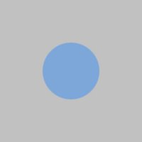
Luckily, RabidVWM provides all this flexibility. The VWM here is just represented by one indexed bitmap:
The miniwindows (graphics drawn to resemble windows on a given desktop) will be drawn dynamically using transparent flat-color boxes.

When coding, a key point I had to look our for is that OTS2 themes now store some RabidVWM settings in the user's personal.rc file, something that's getting my old OTS1 themes in trouble when users try to use them with the new installer. The settings used for the VWM in this theme just specify the graphics, none of the behaviors. This way the user can tweak their own file to change behavior for each theme, rather than hacking each theme to get the behavior they want. Here's the coding in Singularity's ''theme.rc'':
;----[ rabidvwm ]----
VWMPos 31 41
VWMSize 60 40
VWMDesks 2 2
VWMBackBmp vwmbg.bmp
VWMWinColor aaaaaa
VWMWinBorderColor ffffff
VWMWinBevel 1
VWMWinAlpha 180
VWMTitleColor ffffff
VWMSelColor cccccc

VWMSelBorderColor ffffff
VWMSelBorder 1
VWMSelAlpha 100

VWMShowIcons

VWMScaleIconToFit


Just 15 parameters! Not bad.

Saturday, September 17, 2005

Reorganizing xModule Settings

I'm discovering that the documentation for modules like xTray and xTaskbar could be made easier to follow. After being away from LiteStep coding for so long, the documentation looked alien.

One of the problems/tools I've run up against is that of multiple states on multiple taskbars. I initially put together a template xTaskbar parameters file that contained empty parameters for the module that could be copied and pasted into new themes as they're being made. Unfortunately, when I made these templates, I entered all the parameters in a linear fashion for each particular button state.

Here's an example:
tasks1NormalFontAlign left
tasks1ActiveFontAlign left
tasks1MinimizedFontAlign left
tasks1FlashingFontAlign left
tasks1HoverFontAlign left
tasks1GroupedFontAlign left

tasks1NormalFontVertAlign center
tasks1ActiveFontVertAlign center
tasks1MinimizedFontVertAlign center
tasks1FlashingFontVertAlign center
tasks1HoverFontVertAlign center
tasks1GroupedFontVertAlign center

The problem with this is that when I'm tweaking the settings, I'll typically do it one element at a time, in this case, the hover state button, or the normal button state. For this reason, I've been rebuilding the structure of the module parameters. Here's what happens to the above code:
tasks1NormalFontAlign left
tasks1NormalFontVertAlign center

tasks1ActiveFontAlign left
tasks1ActiveFontVertAlign center

tasks1MinimizedFontAlign left
tasks1MinimizedFontVertAlign center

tasks1FlashingFontAlign left
tasks1FlashingFontVertAlign center

tasks1HoverFontAlign left
tasks1HoverFontVertAlign center

tasks1GroupedFontAlign left
tasks1GroupedFontVertAlign center

Now if I want to edit just a particular button, all the parameters are grouped, rather than hunting for the shadow settings here, the outline settings there...

It's a small change in design paradigm, but it's dramatically improved the speed at which I can tweak the xTaskbar parameters.

Wednesday, September 14, 2005

Singularity: System Tray

Making the System Tray Creating the system tray for Singularity was probably one of the easiest parts. Andymon's xTray module is really easy to setup, but still provides a lot of flexibility that previous tray modules didn't necessarily offer.

Desired System Tray Features
  • Want the graphic to use AlphaTransparency.
    • Will require drop-shadows and anti-aliased edges.
    • Here's the graphic:
  • Want the system tray against the left-side of the screen, like the early Photoshop mockup image demonstrated.
  • Graphic must auto-size.
    • Middle part of image must tile (more efficient to render).
    • Top 18 pixels (where it says "TRAY") must remain fixed.
    • Bottom 29 pixels should remained fixed and outside icon area for the bottom shadow and curved part to be rendered properly.
  • Would be nice if the icons could be dimmed, somehow, to make them less visible.
    • Putting the mouse cursor over a tray icon should highlight it, probably by brightening it up to its default appearance.
Getting the tray image situated.
  • The above graphic for the tray was selectively copied from my Photoshop file.
    • The selection was done by turning off any bottom layers so that the grid indicating transparency was visible.
    • The rectangular marquee selection tool was then used to create a big rectangle surrounding the desired part of the graphic, starting a little above where it says TRAY, but going very wide to the right and to the bottom of the image (to preserve any drop-shadow).
    • The Copy-Merged option was then used.
    • A new file was created (CTRL+N). New files are, by default, sized to the same dimensions as the current image in the clipboard. This will be the minimum area required to properly render the drop-shadow.
    • The copied section was then pasted into this new file, and the file saved as a 24-bit PNG image.
  • The traybg.png image was then copied to the ''images'' folder of the theme.
Coding in Theme.RC
This is the part I tend to do by trial and error. Generally, I start off by sticking in every single configuration parameter for the module, getting the positions of everything set right, and then selectively chopping unnecessary parameters. Probably not the most efficient method, but I'm no coder, and this is the method that seems to work for me.

These parameters tell the tray where to position on the screen and how big to make it. I knew where to put it onscreen because I sized things out in Photoshop first:
;----[ xTray ]----
xTrayX 0
xTrayY 320
xTrayAutoSize 20 20
xTrayWidth 38
xTrayHeight 300

These parameters tell xTray where to find the image and how to tile it. The tray will be dynamically sized vertically to contain the tray items. The different xxxxxEdge parameters tell the module what part not to tile. For instance, because I want the top of the image to say "TRAY", but not have that part tiled, the image doesn't start to tile until the 19th pixel from the top (xTrayImageTopEdge is set to 18):
xTrayImage $LSImageFolder$traybg.png
xTrayImageMode tile
xTrayImageLeftEdge 15
xTrayImageRightEdge 22
xTrayImageTopEdge 18
xTrayImageBottomEdge 39

These are a lot of the basic configuration options. Of note, the xTrayAlphaMap setting is critical here because our PNG image uses AlphaTransparency. The borders determine where the icons are actually drawn in our image. The spacing and wrap parameters determine some of the tray behaviors as icons are added or removed. The tooltip parameters have been specified here, 'cuz I like to be able to find out what an icon's for without having to activate it. Read the xTray documentation for a more detailed description of parameters.
xTrayAlphaMap
xTrayBorders 8 12 14 30
xTrayLines 1
xTrayMaxLines 2
xTrayXSpacing 2
xTrayYSpacing 4
xTrayLayout .vertical
xTrayDirection .right
xTrayWrapDirection .top
xTrayWrapCount 10
xTrayShowTooltip
xTrayShowInfoTip
xTrayBalloonTooltip
xTrayTooltipDurations 100 1000
xTrayToolTipColor c1c1c1
xTrayTooltipTextColor 111111
xTrayCleanUpInterval 10000

...And these parameters dim the color and brightness of normal tray icons, but change to full color and brightness if the mouse hovers over them:
xTrayIconSize 16
xTrayIconHueIntensity 150
xTrayIconHueColor 000000
xTrayHoverIconHueIntensity 00
xTrayHoverIconHueColor ffffff

That's it for the tray! If the rest of Andymon's ''x'' modules configure this intuitively, the theme should be well on its way to completion (wish he had a shortcut module).

Next blog will probably tackle at least a basic rendition of the taskbar.

Tuesday, September 13, 2005

Quick progress check

More updates to come shortly. Have been busy in the lab trying to get presentations ready and finish experiments. Also got up Skinyourscreen.com's first Podcast. The AstonShell guys are expecting Nerio and I to hand over SkinWiki for some reason (I'm still a little stymied by their motivations)... needless to say, been a busy week.

Have started coding the system-tray and the taskbar for Singularity, however. The tray is very simple, so my next blog will cover that. As I worked on the taskbar, however, I decided it would be more fun to present several taskbar variations. The xTaskbar module also permits "on-the-fly" parameter changing, so theoretically a user could switch taskbar themes instantly, without recycling. I'm really curious to try out this feature.

More to come. Big presentation on Thursday, September 15th, and after that I should be able to devote more time to Singularity.

Saturday, September 10, 2005

Singularity: Starting to code

Starting some coding Now that some of the graphics have been generated, I want to try 'em out. This means starting the coding of the OTS2 compliant theme. Approaching it from scratch, I layed out the following directory structure in my ''litestep\profiles\shelltest\themes'' folder:
  • Folder: SingularityV0.004
    • Folder: images
    • Folder: config
    • New Text File: ''theme.rc''
    • Copied File: ''Singularity-ReadMe.txt''
Within the theme.rc file (which I edit using jEdit) I added the following text:

OTSMajorVersion 2 OTSMinorVersion 0 ThemeName "Singularity v0.004" ThemeAuthor "mrbiotech" ConfigDir "$ThemeDir$config\" LSImageFolder "$ThemeDir$images\"
We're essentially setting LiteStep variables here. The variable name is on the left, while the contents are on the right. Spaces and tabs between the variable and its data don't matter.

The first two, OTSMajorVersion and OTS2MinorVersion help LiteStep know that the theme should be OTS2 compatible. The next two provide information onwho the author is, what the name of the theme is. The last two define the location of the folders created earlier ConfigDir and LSImageFolder. The variables come in quite handy, as they will eliminate the need to continually rewrite entire paths to configuration and graphic files needed by the theme. You'll notice that the last two pieces of data actually contain a LiteStep variable themselves (the $ThemeDir variable, which defines the SingularityV0.004 folder).

After this are three statements to include outside files that will be created later:

include "$ConfigDir$qlpopup.rc" include "$ConfigDir$popuptheme.rc" include "$ConfigDir$popup-$popupStyle$.rc"

The first will load any settings present in a file called qlpopup.rc that will be created in the theme's config folder, containing settings pertaining to a quicklaunch menu The other two will load settings pertaining to the theme's configuration popup-menu, and a theme-style specific menu configuration (this theme may have more than one style of menu).

After this, it's time to load a module. I think the bare minimum modules that any theme should include are a popup-menu module and a desktop module to activate the popup-menu. I've been dying to try Andymon's xPopup and already am fond of the jdesk module, so here's the code to get them loaded at theme startup:

*NetLoadModule jdesk-0.73 *NetLoadModule xpopup-1.1.9
Configuring jDesk Luckily, the OTS2 setup centralizes some of the Jdesk settings to the user's personal.rc folder. This means that all we really need to configure for this module is the size of the desktop that applications can take up. From the graphics I made for the theme I have an idea that the taskbar at the screen top will be about 30 pixels high, and the vertical system tray at the screen's left will be about 30 pixels wide. I'd like at least the taskbar visible at all times meaning the screen area will be 30 pixels shorter on top. If I want both the Tray and the Taskbar visible at all times, I'll need to reduce the area of the screen useable by applications by 30 pixels from the left side as well.

Here are the entries in the theme.rc file:

;----[ jDesk ]---- jDeskWorkArea "30,30,0, 0" *jDeskMButton3 [.none;!popupql;!none;!none]

The first line is simply a comment, a title to let me know what configuration this section is for. The next button instructs the jDesk module to leave 30 pixels of space on the left and top of the screen for the tray and taskbar. Maximized applications will not move into those territories. The last line is something I added for testing purposes, allowing me to test a second popup-menu type devoted directly to quicklaunch items that will be accessible by middle-clicking the desktop.

Configuring xPopup Let the fun begin: This is where I apply the theme's first graphic. The xPopup module functions quite a bit differently than earlier popup modules. It permits full Alpha-Transparency, meaning I can create a popup with Anti-Aliased edges and drop shadows. It also can use just a single graphic and stretch or tile it. Here's are two Photoshop mockup of what I want the popup to look like:
The top one was my first idea, and I actually implemented all the code on it before realizing the design sucked. The second was the one I settled on, and the one I'll show the code for. Both will actually be included in the theme, for user preference.

Here's the xPopup configuration code for the second popup prototype:

;----[ xpopup ]----
; These settings are in the POPUP-V.RC and POPUP-H.RC files in $configdir$
xpopupcompatibilitymode
xpopupAutoMenuBreak true
xpopupmoveable
xPopupFolderOpenDelay 150
xPopupAlphaMap
xPopupBalloonTip true
xPopupTooltipDurations 200 1000
xPopupAutoMenuBreak
xPopupEnableDragnDrop
xPopupShadeable
xPopupCloseAfterAction

qlAddToGroup ""
qlAlphaMap
qlQuickLaunchMode .horizontal
qlEntryUseBigIcon
qlEntryIconSize 32
qlQuickLaunchItemSize 64
qlQuickLaunchOpenTo .right
qlQuickLaunchWrapCount 10
qlImage $LSImageFolder$qlbg.png
qlActiveEntryImage $LSImageFolder$qlactive.png

qlEntryIconX 16

qlImageMode tile
qlImageLeftEdge 16
qlImageRightEdge 16
qlImageTopEdge 26
qlImageBottomEdge 26

qlActiveEntryImageMode tile-horizontal
qlActiveEntryImageLeftEdge 22
qlActiveEntryImageRightEdge 22

qlOverlapY 10

qlBalloonTooltip true
qlTooltipMode .all

This contains some of the general module parameters at the top and then the definition of the quicklaunch test popup. (Note: I'm still experimenting at this point, so although the quicklaunch is implemented here using graphics from another one of my themes, it will change significantly. The location of the quicklaunch configuration will also likely be moved to an external file).

Inside the config folder of the theme I created a new file called popup-1.rc. This contains the configuration parameters for the second (preferred) popup prototype, which I show below:

;-----[ xPopup settings for popup style 2 ]-----
xPopupImage $LSImageFolder$popupbg-v.png
;xPopupActiveEntryImage $LSImageFolder$popup_a2.png
;xPopupSeparatorImage $LSImageFolder$popup_sep.png

;xPopupImageTrueTransparent false
xPopupImageMode tile
xPopupImageTopEdge 54
xPopupImageBottomEdge 26
xPopupImageLeftEdge 68
xPopupImageRightEdge 26

;xPopupActiveEntryImageMode tile
;xPopupActiveEntryImageLeftEdge 22
;xPopupActiveEntryImageRightEdge 22
;xPopupActiveEntryImageTopEdge 0
;xPopupActiveEntryImageBottomEdge 0

;xPopupSeparatorImageMode tile-horizontal
;xPopupSeparatorImageLeftEdge 30
;xPopupSeparatorImageRightEdge 30

xPopupTitleHeight 54
xPopupTitleFont "Tahoma"
xPopupTitleFontColor c1c1c1
xPopupTitleFontHeight 16
xPopupTitleFontLeftBorder 45
xPopupTitleFontRightBorder 25
xPopupTitleFontTopBorder 14
xPopupTitleFontBottomBorder 5
xPopupTitleFontAlign center
;xPopupTitleFontOutline
;xPopupTitleFontOutline Color ffffff
xPopupTitleFontShadow
xPopupTitleFontShadowColor 111111
xPopupTitleFontBold

xPopupEntryFont "Tahoma"
xPopupEntryFontHeight 12
xPopupEntryFontColor c1c1c1
xPopupEntryFontAlign left
;xPopupEntryFontTopBorder 48
;xPopupEntryFontBottomBorder 36
xPopupEntryFontLeftBorder 36
xPopupEntryFontRightBorder 26
xPopupEntryFontShadow true
xPopupEntryFontShadowColor 000000
xPopupEntryFontShadowX 1
xPopupEntryFontShadowY 1
xPopupEntryIconX 10

xPopupActiveEntryFontColor ffffff
xPopupActiveEntryFontAlign left
xPopupActiveEntryFontBold
xPopupActiveEntryShowIcon
xPopupActiveEntryFontOutline true
xPopupActiveEntryFontOutline Color 333333
xPopupActiveEntryIconSize 24

xPopupFolderShowIcon

;xPopupOverlapX 0

xPopupEntryHeight 20
xPopupActiveEntryHeight 20
xPopupFolderHeight 20
xPopupActiveFolderHeight 20

xPopupMaxWidth 500
xPopupMinWidth 140
xPopupTopBorder 50
xPopupBottomBorder 28
;xPopupLeftBorder 50
;xPopupRightBorder 12
;xPopupAlphaFade
;xPopupCustomAlphaFade 20 20

xPopupArrowImage $LSImageFolder$popupfolder.png
xPopupArrowOffset 9
xPopupArrowOnLeft false
xPopupActiveArrowImage $LSImageFolder$popupfolderactive.png
;xPopupActiveArrowOffset 6
;xPopupArrowOnLeft false

You'll see that there are a lot of commented lines (nonfunctional lines preceded by ";"). I tend to throw in more options than are necessary at the beginning, using a template file that contains ALL the configuration parameters for a given module. Then later I can delete what I don't need. The code as it stands here is capable of rendering the popup the way I want, so the commented lines will probably get the axe soon.

There is also a similar configuration file called popup-2.rc which contains the parameters and definitions required for the initial popup design, should the user select them.

Conclusion
Something that's very difficult to capture in a blog is the trial-and-error nature of this. To get to the settings you see above took about 2 days of tweaking, changing single parameters and recycling the theme to see what the end effect is. After about 100 recycles, it ended up the way I wanted, at least for now. I suppose I could have been more organized in the Photoshop mockup, measuring out exactly where I wanted the text and icons to sit, but it seemed like too much trouble. In 20/20 hindsight, however... Oh well.

At least there's a working popup.

Next time I'll make a system tray and a basic taskbar.

Friday, September 09, 2005

Singularity: Graphic Design 2

Purpose
The previous blog outlined the shapes that will make up the new Singularity theme. This entry will focus on the LayerStyles applied to these shapes to create the 3-dimensional feel.

Rather than describing each Layer Style used in this theme in excruciating detail, I'm going to demonstrate some of the usage principals of LayerStyles. This way I don't end up with a ton of instant imitators. More importantly, however, this should assist individual users in coming up with their own characteristic styles and designs.

The LayerStyles
LayerStyles are non-destructive, dynamic effects that can be added, altered, and removed from individual layers in Adobe Photoshop. They're convenient because they can be stored in a palette, applied on a whim, or exported to libraries of layer styles. The true power, however, resides in their infinite variation and their non-destructive nature. This is why my themes are composed as groups of shapes that can then be stylized later. Access the LayerStyles options for a layer by double-clicking it, or right-clicking and selecting "Blending Options".

Below are descriptions of some of the LayerStyles employed to make this theme:

Blending Options
The BlendingOptions panel of LayerStyles provides access to the layer opacity and blend mode (overlay, multiply, etc.) for a given layer. It can do much more, however.

  • In addition to altering a layer's Opacity, you can use the Fill Opacity settings to have only the LayerStyles for a layer show, while the actual layer graphics are invisible. This permits the designer to use the same layer-style type (i.e. Bevel And Emboss) multiple times for one graphic. The initial layer containing the graphic is simply duplicated, the duplicate layer's Fill Opacity set to 0, and the additional layer-styles applied.
  • Below is an example showing the base layer with a Bevel And Emboss style applied, and the next 3 images showing duplicated or alternate Beveling set through this method:
  • The BlendingOptions can also be used to Knock Out layers beneath. The Knockout mode can be set to shallow (knock out the layer immediately under this one) or deep (knock out all layers in this layer folder). This can be beneficial if you have a nice smooth layer-style applied to one layer, but want to punch through it to see a layer below. In the below example, Part A is the shape that will knock out part of the layer in Part B. Part C demonstrates the completed knock out. Part D demonstrates the unfavorable result of simply erasing Part B instead of knocking it out. Notice how the Bevel is affected?:
Drop Shadows
Adding a drop-shadow to your graphics can improve the perception of depth, especially when the graphic is composed of multiple parts on different Z-orders. The key is to keep it just light enough that it's believable, as not to obscure features beneath. (I tend to gob my drop-shadows on liberally, or at least that's what people tell me).

Below is an example image containing variations of drop-shadows. No, your shadow doesn't have to be black, and no, the standard curve isn't always the most interesting one.
Descriptions:
1: No layer-style applied.
2: Photoshop's default drop-shadow.
3: Distance=3px, Size=3px, Contour=Guassian.
4: Blend Mode=Screen, Color=White, Distance=3px, Spread=100%, Size=7px, Contour=Guassian.
5: Angle=-60 (Global Light unchecked).
6: Distance=1px, Size=0px.
7: Two layers, 1st with Blend Mode=Screen, Color=White, Distance=2px, Size=7px contour=Guassian; 2nd with Multiply, Black, Angle=-60 (Global Light unchecked), Distance=2px, Size=7px, Contour=Guassian.
8: Opacity=100%, Size=9px, Noise=19%.


Using the Blending Options technique to employ multiple drop-shadows on item 7 yields an artificial beveling technique. Doing this permits greater flexibility in the distance, spread and size of the dark part of a bevel versus the light part. I've used this technique in situations where an odd-shaped bevel is on the underside of a 3-dimensional shape and I want to emphasize one of the shine differently than the shadow.

Inner Shadow
The ''Inner Shadow'' style can be applied for a variety of purposes beyond just creating inset depth.
  • The InnerShadow style can assist metallic layer-styles by providing angle-specific highlighting or shadowing.
  • It can create greater depth when used in conjunction with gel or glass effects.
  • It can render quick-and-dirty 3D-effects without the use of the gradient tool.
Descriptions:
1: No layer-style applied.
2: Photoshop's default inner-shadow.
3: Angle=-60 (Global Light unchecked), Distance=7px, Size=16px, Contour=Guassian.
4: Opacity=35%, Angle=-90 (Global Light unchecked), Distance=11px, Size=13px, Contour=Ring.
5: Blend Mode=Screen, Color=White, Opacity=80%,Angle=90 (Global Light unchecked), Contour=Cone, OuterGlow set to Multiply and Black, and default GradientOverlay.
6: Angle=-60 (Global Light unchecked), Distance=8px, Size=13px, Contour=Cone, Custom InnerGlow and ColorOverlay.
7: Distance=10px, Size=13px, DropShadow, BevelAndEmboss, and a ContourEffect.
8: Distance=3, Size=6, BevelAndEmboss set to Down.

Note: Variations 1-4 contain just the Inner Shadow effects alone. Variations 5-6 use InnerShadow styles in conjunction with other LayerStyles to demonstrate how they work synergistically.

Outer Glow
Key thing to note about the Outer Glow: the default settings suck. I've used the light glow a few times for digital buttons or controls, but a far more effective use of this style is the creation of slight shadows. This is great for offsetting overlapping features, like a very subtle spank shadow. Use it with the Mode set to Multiply or Normal and the Color set to black. This style is a condiment, use just a dash in your graphics to dimensionalize overlapping graphics.
Description: 1: No layer-style applied. 2: Photoshop's default outer glow. 3: Mode=Multiply, Color=Black. 4: Mode=Multiply, Color=Black, combined with SatinEffect and GradientOverlay styles.

Inner-Glow

The InnerGlow style, like the Outer-Glow style, seeme to work best if you DON'T use the default settings. As demonstrated in the Inner Shadow write-up, when the color is set to black and the mode to multiply it can render some convincing spherical effects. Subtle use of this style in this manner can add additional depth to your graphics.

When multiple inner glows are overlapped (using the Blending Options technique), one can generate pseudo-metallic effects (example #4).
Descriptions: 1: No layer-style applied. 2: Photoshop's default inner glow. 3: Mode=Multiply, Color=Black. 4: Layer 1: Mode=Multiply, Color=Black, size=16. Layer 2 (top): Fill Opacity=0%, size=16, Contour=Cone.

Bevel And Emboss

One of the most versatile, attractive, and useful LayerStyles you will use is the BevelAndEmboss style, coupled to the ContourEffect and perhaps the TextureEffect styles.

Samples 1-5 show essentially the default bevels possible by simply trying different combinations of Up/Down and Inner/Outer bevel. These are pretty common (a.k.a. "boring") applications of the bevel effect. By themselves, these styles are frequently used for basic web-buttons, and varying from the up vs. down bevel methods can yield convincing unpressed and pressed states.

The true power of the bevel, however, lies in the Angle and Altitude. Try taking the default inner/up bevel settings, unchecking Use Global Light and then setting the altitude to 60. It should make the shine appear like it's more towards the center of the shape. If you activate the Contour-Effect layer style and select the "Half Round" contour, it should create an ever more believable effect, almost like a drop of water. Varying the Depth and the Size of the Bevel can create some very believable jelly/glass effects. This is the principle technique of my style in Photoshop.

In addition to glassy effects, this method can be used for broad, subtle insets, or even raised/recessed combo features (as seen in example 7).

If you use a brush (like the air-brush tool) with reduced drawing opacity and a bevel effect added, you can create some interesting subtle features. For more details on this particular technique, consult my Subtle Insets and Bevels Tutorial.
Descriptions:
1: No layer-style applied. 2: Photoshop's default bevel (inner bevel, up). 3: Inner bevel, direction=down. 4: Outer bevel, direction=up. 5: Outer bevel, direction=down. 6: Inner bevel, direction=up, Depth=41%, Size=21px, Use Global Light unchecked, Altitude 63. Contour Layer-style: Contour=Half Round. 7: Advanced layer-style: Outer bevel, Depth=51%, Direction=up, Size=27px. Dark inner-glow, GradientOverlay, and an inner gradient stroke of 3-pixels were also added. This style is all over the Singularity theme. 8: Advanced layer-style: Many layerstyles on at least 2 different layers creating an inset glass button with a shine bevel, and a reflected shine bevel.

Contour Effect
The Contour layer-style can only be used in conjunction with the Bevel And Emboss layer-style. All it really does is determine the "curvature" or shape of the bevel itself. Think of the Contour as the drill-bit that would be used in a routing machine to create moulding for a wall or piece of furniture: it determines the cross-section of the bevel.

As far as my glass-effects go, I stick to the Half Round contour.

Texture Effect
The Texture option only affects the Bevel And Emboss layerstyle. It will apply any texture in your texture to the bevel. Interesting if you want a gritty bevel, I suppose. Have never used this in a theme, however.

Satin Effect
The Satin Effect can be used for a variety of metallic textures, or to produce symmetrical shines on rounded or irregularly-shaped objects, like text.

I prefer to use the Contour=Cone settings for these, using either the multiply mode with black, or the screen mode with white. The size and distance are adjusted for the size of the shape in question: text will require different settings than small spheres. Hint: these are great for small metallic buttons or screws.
Descriptions:
1: No layer-style applied.
2: Photoshop's default satin effect.
3: Angle=-60, Distance=3px, Size=10px, Contour=Cone, Invert is checked.
4: Mode=Screen, Color=White, Angle=-60, Distance=4px, Size=10px, Contour=Cone, Invert is unchecked. Dark OuterGlow, Dark and InnerGlow added to enhance appearance as a button.
5: It's a baseball: Mode=Screen, Color=white, Angle=-42, Distance=28, Size=1, Contour=Cone, Invert is checked.
6: Psychedelic design using wierd contour.
7: Another psychedelic design using the contours.
8: Same as #4, but using a high-angle BevelAndEmboss/ContourEffect, some ColorOverlay, and a 3px external StrokeEffect using the gradient option.

Color Overlay
In my skins, the Color-Overlay style serves three primary purposes:
  1. Lightening or darkening of a layer, using either the Multiply, Screen, or Overlay modes with either White or Black. It's a quick easy, non-destructive way of quickly changing the luminescence of a particular layer without permanently altering it.
  2. Swapping out colors for color-schemes: Typically I'll create all my shapes layers in shades of grey so that color applications don't end up with semi-unpredictable results.
  3. Alternate Button States: Simply lightening, darkening, or changing the color of a button or graphic can be enough to indicate a hover, active, or clicked state. Although this is really just a variation of the first two uses, I do use it A LOT. Rather than creating a separate set of graphics on different layers and applying all-new layer-styles to represent the clicked state of buttons, I simply turn on a ColorOverlay style and VOILA!
Gradient Overlay
This is another versatile little effect that makes its way into so many of my skins. Believe it or not, I typically use this one with almost the default settings! (Okay, minor variations).
  • Metallic Tubes: (Example 1) Rather than use the formal Gradient Tool to apply gradients in a selection area, it's much easier (and non-destructive) to use the GradientOverlay style to create unidirectional tubes and hoses.
  • The gradient editor for the GradientOverlay style is the same as that used for the Gradient Tool.
  • Using this style applies gradients dynamically, so if you're not totally satisfied with your gradient, you can change it at a whim, days later even.
  • Chisels, insets, and divits:' (Example 2) Using the basic black to white fade, existing shapes can be made to appear as though chiselled out of a layer beneath them.
  • The direction of the Gradient should be applied to the layer such that the black part of the gradient is in the direction of the light-source.
  • I commonly use the Overlay mode with this, provided I'm applying the gradient to a layer with a color other than black.
  • Glass effects: (Example 3) To create truly cool glass shine effects, I'll often use the BevelAndEmboss method coupled to a layer that uses a manually drawn shine. This is just another shape layer with LayerStyles applied to it.
  • The shine graphic itself is usually drawn in white.
  • The //Fill Opacity is reduced to 0-20%.
  • A GradientOverlay is set from White to Black, White in the direction of the light source.
  • The GradientOverlay mode is set to Screen.
Pattern Overlay
Another one of my favorite LayerStyles. I've created probably 10-20 patterns that I use regularly in my themes. typically, these are applied to a layer using the Overlay mode, or perhaps Screen or Multiply. Most of these are simply geometric patterns composed in boxes of between 2x2 up to 40x40 pixels, things which are easy to tile or repeat.

One of my favorite patterns to apply are T.V. Lines, the simplest pattern. Create a new graphic that is 2 pixels tall by 1 wide, and fill the top pixel with black. Select the whole thing and save it as a pattern. BAM!! Instant lined pattern. Quite often I'll save a version using black, and then using white, just in case I want to use the Screen vs. Multiply modes.

Think simple in making your patterns. Most of mine are simply repeating boxes, circles, or other geometric shapes. Try using both White and Black and then setting the PatternOverlay mode to Overlay. Take a look at Treetog's Sputnik theme and you'll see a variation of this all over.

Stroke Effect
The StrokeEffect can also be used to produce external or internal chiselled areas by setting it to produce a gradient. The inset look around some of the blue orbs was generated this way.

In Singularity, the Stroke effect was used to generate some of the dark rings present around the blue orbs. This was accomplished by setting the stroke color to black, the mode to Overlay or Multiply and then tweaking the size until the desired effect was reached.

This style can also be used to create tubes, if you think creatively enough. By setting the stroke to produce a Shape-burst Gradient, and selecting something as simple as the black-to-white gradient, any shapes you draw will create a tubular outline. For this to be most effective, you need to reduce the layer's Fill Opacity to 0, and be sure to use an anti-aliased tool, such as a hard-edged paintbrush.

Hopefully after reading all those entries you'll be able to look at my themes and tell me what Layerstyles you suspect were applied. The key here is to not be limited by your tools. The stock bevel makes me sick, and yet it ends up in so many themes around the web. If you just tweak things a little bit you'll end up with some nice variety. If you try changing the entire paradigm of a style (like using inner-glows to darken instead of lighten) you might surprise yourself with what you can do!

Sunday, September 04, 2005

Singularity: Graphic Design 1

The Original Singularity Let's take a look at how the original Singularity graphics were composed:
  1. Circular and Rectangular Marquee tools were used to create blocky grey shapes in Adobe Photoshop.
  2. The blocky shapes were then refined by using circular selection tools and the erase tool to round edges.
  3. Once the shapes were settled upon, the layer-styles were applied and successively refined.
Below is a snapshot from the original Singularity Photoshop file, showing the design at step 2. All the shapes are essentially refined to what they will be in the final rendering.

Note: There are quite a few overlapping shapes that are exactly the same color, so some theme elements aren't visible here, but will be when the LayerStyles are applied:
Now, here is the same image with the LayerStyles activated and finalized (step 3 of the graphic design):
The NEW Singularity In the previous blog I outlined the goals of the revised theme. Specifically, a more rounded/organic shaping of the theme was desired. Here's my mockup in Photoshop, showing the shapes that will become the theme:
Now here's a preview of the new design, showing the upper-left control cluster and the new popup-menu:
As you can see, the general form and style of the theme are all still there. The graphics have changed slightly, as my skills have (hopefully) improved from where they were 4 years ago.

Making the Graphics: Rounding Technique
Now, let's see in more detail how this is done. We'll go over Steps 1 and 2 for the time being, and I'll try to pick up more on the LayerStyles (Step 3) for the next blog.

In Adobe Photoshop I created a file 500 pixels by 500 pixels with a transparent background. The first (and only) layer was then filled in with a uniform grey, although any color will suffice. The Circular Marquee Tool was then selected with the following parameters: Mode: Fixed, Width: 80px, Height: 80px. On a new layer (Ctrl+Shift+N) I made the selection and then filled it in with a blue color. This shape was then moved to the upper left of the image, equidistant from both the top and left edges of the image. Yup, you guessed right: it will be the big-blue orb characteristic of the theme:

In advance, I know that this theme will have elements designed that may go beyond the edge of the Photoshop image. when Photoshop tries to process LayerStyles on layers that lay on the border of the image, wierd things can happen (especially with bevels). To compensate for this, I'll often create a total-image border that will represent the actual screen-edge for the finished theme graphics. On a new layer I created a 40px border around the entire image using the Rectangular Marquee Tool.
What would Singularity be without some cool looking metal? Let's start making it by first creating a circular area on a new layer that's 130px by 130 px and filling it with a medium-grey color:
Now the circle that will be metal should be moved underneath the blue orb layer, and centered relative to the blue orb layer.
Now that the metal circle is centered to the blue orb and behind it, the metallic shape is expanded. You could use marquee selection tools for this, but I just used a brush set on pencil mode and boosted up the thickness to around 20-30 pixels. Then I started from the top center of the metal ring and drew out to the right of it, or down from it, both lines drawn flush to the artificial screen-edge (the red part).
To round this shape off I used some oval selections, sized either 200x100 pixels, or 100x200 pixels. In the below image, the selection areas are simple shown as black ovals. These selections were positioned to that one edge butts up against the lines we created in the last step, while one of the pointed ends touches the metallic-grey shapes.
The selection area is reversed (Ctrl+Shift+I) so that everything outside our ovals is selected. Then using another pencil/brush tool, I stroked in the empty area on the metal layer to round out the shape:
Next blog will likely be on the use of LayerStyles. Below is a test-render of the image applying some of my favorite LayerStyles. LayerStyles are so effective because they simply change the effect of a shape in real-time, permitting fine-tuning. They're also non-destructive, and may be turned off at any point or deleted without effecting the actual layer contents.

Saturday, September 03, 2005

Singularity: Getting Started

Preface
Let me preface this entry by stating that I've been working on the rebuild of the Singularity theme for two weeks already, so what I'm writing here is, in actuality, old news. It's still going to be included, however, to give anyone interested a sense of the overall work-flow.

Design intentions
Before even touching the computer for graphic or code design I try to envision what I want it to do, how the theme should work. Luckily, because this is a remake of an older theme, much of this guess-work has already been accomplished. Here are some of the things I wanted this time.

I want the re-created theme to retain much of the functionality of the original:
  • The ConfigurableHotspots must remain.
  • The ConfigurableHotspots must retain their original configuration via a popup GUI.
  • The ConfigurableHotspots should activate after a predetermined amount of time, so not every casual bump into the corner of the screen activates them.
  • This will require the Timer module and ckHotSpots.
  • The configurable nature of the theme will require scripting:
  • MzScript is my scripting module of choice.
  • LsLua is an alternate scripting module, although using it will require me to learn a new scripting language.
  • TextEdit2 may be needed.
  • Would prefer the theme "remembers" the users settings so they don't have to continually reselect theme options when they recycle.
The graphic-feel of the theme should remain similar:
  • I'd prefer something a little more rounded, more organic in shape.
  • The corner-based orientation of GUI elements should be retained.
  • Many of the same LayerStyles from the original Photoshop images can be used here, with some additional tweaking.
  • Still needs to be blue crytalline thingies over a metallic base.
  • AlphaTransparency will again be required, due to the curved shapes and drop-shadows employed by the theme elements.
  • This will require the use of either the ShortCut3 module, or the LayerCuts module.
Some theme elements will have to be changed altogether:
  • The bPopup module used for the quicklaunch icons (the tabs at the left side of the theme) is obsolete now that Andymon has published the all-powerful xPopup.dll module, which supports multiple popup formats.
  • While using xPopup, might as well recreate a better-looking primary popup menu.
  • The new popup-menu can use AlphaTransparency with xPopup!
  • I want desktop icons! Need to implement a module that will allow this, perhaps Andymon's xDeskTop module.
  • Probably don't need a second WinAmp control in the upper-left control cluster.
  • Can use xLabel to display song information instead of the ever-buggy JampToo module.
  • MUST be truly OTS2 compliant.
Required tools
So now that I know what the theme should do in relation to the previous version, we need to know what tools I'll have to employ to get this thing assembled and functional.
LiteStep
  • You're not going to get very far making LiteStep themes if you don't have LiteStep. If you click on LiteStep, you'll find a link to Omar Hussain's excellent installer package.
Graphical Editor
  • I prefer Adobe Photoshop. Specifically, I use version 6.0 because it's what I've had for years and does well (coupled to the fact that I can't afford the full CS2 version). My style makes heavy use of the LayerStyles in Photoshop to accomplish the visual effects.
Text/Code Editor
  • I've switched almost entirely to jEdit for my code-editing purposes. It's syntax-highlighting and expandability are literally amazing, like an Emacs that's easy to use and configure. Because it's JAVA based, it'll run on my Mac or my PCs, or in Linux.
  • I used to use Stardock's ObjectEdit for editing code and LiteStep RC files, but setting up it's syntax-highlighting was a pain, and more often than not, it simply displayed everything in plain black-and-white anyway.
So now that we know what's needed, I'll try and cover several of the graphical design aspects of the Singularity theme.

In the beginning

My first themes for LiteStep, SEQ(uencer) and Singularity were made around 2002. They were developed under LiteStep 0.24.6 using OTS1 standards.

SEQ(uencer) started off around the concept of a curved taskbar. I wanted a feature-rich but simple theme, one that would provide access to a few EVARs, require minimal scripting, but still be able to have plenty of configurability for wallpapers and color themes. The goals were met, but it still lacked certain features I would have preferred, such as AntiAliasing in the graphics, AlphaTransparency, and true ResolutionIndependence.

Singularity was my second theme, and a much more ambitious project. It made heavy use of the AntiAliasing desired for SEQ(uencer). The primary concept, however, was not the unique graphics. The core reason the theme was made was to accentuate the GUI concept of ConfigurableHotspots, in accordance with FittsLaw about interface design. This entailed creating shortcuts to programs or system-functions which could be the most easy to reach. This meant using the corners of the screen as HotSpots, hover the mouse over them and they activate. They gain their efficiency from the fact that no click is required, and the mouse is naturally collected at any screen corner if you move the mouse with sufficient velocity in any direction. These HotSpots could then be configured by the user to control various functions, like activating WinAmp, switching VWMs, or more. This concept functioned quite well with the heavy graphics of the Singularity theme, which sprawled over several corners of the screen but could instantly be whisked away or Z-Order flipped to the desktop to permit full access to actual productivity programs.

Other projects quickly followed as I became overly infatuated with LiteStep. Prion, NonDisjunction, PhenotypeII and Recombinant all followed suit, aiming to use the ConfigurableHotspots concept for user interaction.

The nagging.
There are probably hundreds of people who have sent in requests to update my LiteStep themes since the arrival and predominance of OTS2. In addition, there have probably been about 30 individuals who have attempted, with permission or without, to post updates of my themes. I appreciate the fact that people enjoy the themes, but I'm always a little leary of permitting others to do work that I myself should be doing, especially when it involved my own creative endeavors.

OTS2 turned out to be a mixed bag for me. It simplified the end-user experience, but I fear did so at the themer's expense. It's an excellent set of standards, but for me it was difficult to grasp, especially after taking the time to get familiar with OTS1. This hampered progress principally by eroding my will to continue with LiteStep.

Around this time, the gracious AstonShell community came knocking, asking for some themes in return for free keys to their software. AstonShell was one of the first skinnables I had a desire to design for, nearly a year before even attempting to skin LiteStep. My skills, however, were tremendously lacking at the time. I actually submitted an AltDesk and AstonShell theme as the first skins I ever made for anything (all rejected). When the time came a year and a half later to get free keys and skin for them, I jumped on it.

Still the emails from LiteStep users kept coming. Putting up my own site simply intensified this. But here's where the true nagging started... My conscience... well, it kept telling me how much I enjoyed the absolute free-form skinning freedom found in LiteStep. My old themes were getting older by the minute, more outdated, less desirable, and yet still there were people requesting them.

So, under some gentle prodding by some people recently, I've decided to remake these old themes and document the process.

The first theme to be recreated will be Singularity, the theme I receive the most requests for. For the sake of brevity (long since expended), I've been working on it for about two weeks so far, so I'll do individual write-ups on the design concepts, the module-selection process and creation of the graphics.