Singularity: Graphic Design 2
Purpose
The previous blog outlined the shapes that will make up the new Singularity theme. This entry will focus on the LayerStyles applied to these shapes to create the 3-dimensional feel.
Rather than describing each Layer Style used in this theme in excruciating detail, I'm going to demonstrate some of the usage principals of LayerStyles. This way I don't end up with a ton of instant imitators. More importantly, however, this should assist individual users in coming up with their own characteristic styles and designs.
The LayerStyles
LayerStyles are non-destructive, dynamic effects that can be added, altered, and removed from individual layers in Adobe Photoshop. They're convenient because they can be stored in a palette, applied on a whim, or exported to libraries of layer styles. The true power, however, resides in their infinite variation and their non-destructive nature. This is why my themes are composed as groups of shapes that can then be stylized later. Access the LayerStyles options for a layer by double-clicking it, or right-clicking and selecting "Blending Options".
Below are descriptions of some of the LayerStyles employed to make this theme:
Blending Options
The BlendingOptions panel of LayerStyles provides access to the layer opacity and blend mode (overlay, multiply, etc.) for a given layer. It can do much more, however.


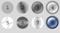
Drop Shadows
Adding a drop-shadow to your graphics can improve the perception of depth, especially when the graphic is composed of multiple parts on different Z-orders. The key is to keep it just light enough that it's believable, as not to obscure features beneath. (I tend to gob my drop-shadows on liberally, or at least that's what people tell me).
Below is an example image containing variations of drop-shadows. No, your shadow doesn't have to be black, and no, the standard curve isn't always the most interesting one.
 Descriptions:
1: No layer-style applied.
2: Photoshop's default drop-shadow.
3: Distance=3px, Size=3px, Contour=Guassian.
4: Blend Mode=Screen, Color=White, Distance=3px, Spread=100%, Size=7px, Contour=Guassian.
5: Angle=-60 (Global Light unchecked).
6: Distance=1px, Size=0px.
7: Two layers, 1st with Blend Mode=Screen, Color=White, Distance=2px, Size=7px contour=Guassian; 2nd with Multiply, Black, Angle=-60 (Global Light unchecked), Distance=2px, Size=7px, Contour=Guassian.
8: Opacity=100%, Size=9px, Noise=19%.
Using the Blending Options technique to employ multiple drop-shadows on item 7 yields an artificial beveling technique. Doing this permits greater flexibility in the distance, spread and size of the dark part of a bevel versus the light part. I've used this technique in situations where an odd-shaped bevel is on the underside of a 3-dimensional shape and I want to emphasize one of the shine differently than the shadow.
Inner Shadow
The ''Inner Shadow'' style can be applied for a variety of purposes beyond just creating inset depth.

Descriptions:
1: No layer-style applied.
2: Photoshop's default inner-shadow.
3: Angle=-60 (Global Light unchecked), Distance=7px, Size=16px, Contour=Guassian.
4: Opacity=35%, Angle=-90 (Global Light unchecked), Distance=11px, Size=13px, Contour=Ring.
5: Blend Mode=Screen, Color=White, Opacity=80%,Angle=90 (Global Light unchecked), Contour=Cone, OuterGlow set to Multiply and Black, and default GradientOverlay.
6: Angle=-60 (Global Light unchecked), Distance=8px, Size=13px, Contour=Cone, Custom InnerGlow and ColorOverlay.
7: Distance=10px, Size=13px, DropShadow, BevelAndEmboss, and a ContourEffect.
8: Distance=3, Size=6, BevelAndEmboss set to Down.
Note: Variations 1-4 contain just the Inner Shadow effects alone. Variations 5-6 use InnerShadow styles in conjunction with other LayerStyles to demonstrate how they work synergistically.
Outer Glow
Key thing to note about the Outer Glow: the default settings suck. I've used the light glow a few times for digital buttons or controls, but a far more effective use of this style is the creation of slight shadows. This is great for offsetting overlapping features, like a very subtle spank shadow. Use it with the Mode set to Multiply or Normal and the Color set to black. This style is a condiment, use just a dash in your graphics to dimensionalize overlapping graphics.
 Description:
 1: No layer-style applied. 2: Photoshop's default outer glow. 3: Mode=Multiply, Color=Black. 4: Mode=Multiply, Color=Black, combined with SatinEffect and GradientOverlay styles.
Inner-Glow
The InnerGlow style, like the Outer-Glow style, seeme to work best if you DON'T use the default settings. As demonstrated in the Inner Shadow write-up, when the color is set to black and the mode to multiply it can render some convincing spherical effects. Subtle use of this style in this manner can add additional depth to your graphics.
When multiple inner glows are overlapped (using the Blending Options technique), one can generate pseudo-metallic effects (example #4).

Descriptions: 1: No layer-style applied. 2: Photoshop's default inner glow. 3: Mode=Multiply, Color=Black. 4: Layer 1: Mode=Multiply, Color=Black, size=16. Layer 2 (top): Fill Opacity=0%, size=16, Contour=Cone.
Bevel And Emboss
One of the most versatile, attractive, and useful LayerStyles you will use is the BevelAndEmboss style, coupled to the ContourEffect and perhaps the TextureEffect styles.
Samples 1-5 show essentially the default bevels possible by simply trying different combinations of Up/Down and Inner/Outer bevel. These are pretty common (a.k.a. "boring") applications of the bevel effect. By themselves, these styles are frequently used for basic web-buttons, and varying from the up vs. down bevel methods can yield convincing unpressed and pressed states.
The true power of the bevel, however, lies in the Angle and Altitude. Try taking the default inner/up bevel settings, unchecking Use Global Light and then setting the altitude to 60. It should make the shine appear like it's more towards the center of the shape. If you activate the Contour-Effect layer style and select the "Half Round" contour, it should create an ever more believable effect, almost like a drop of water. Varying the Depth and the Size of the Bevel can create some very believable jelly/glass effects. This is the principle technique of my style in Photoshop.
In addition to glassy effects, this method can be used for broad, subtle insets, or even raised/recessed combo features (as seen in example 7).
If you use a brush (like the air-brush tool) with reduced drawing opacity and a bevel effect added, you can create some interesting subtle features. For more details on this particular technique, consult my Subtle Insets and Bevels Tutorial.

Descriptions:
1: No layer-style applied. 2: Photoshop's default bevel (inner bevel, up). 3: Inner bevel, direction=down. 4: Outer bevel, direction=up. 5: Outer bevel, direction=down. 6: Inner bevel, direction=up, Depth=41%, Size=21px, Use Global Light unchecked, Altitude 63. Contour Layer-style: Contour=Half Round. 7: Advanced layer-style: Outer bevel, Depth=51%, Direction=up, Size=27px. Dark inner-glow, GradientOverlay, and an inner gradient stroke of 3-pixels were also added. This style is all over the Singularity theme. 8: Advanced layer-style: Many layerstyles on at least 2 different layers creating an inset glass button with a shine bevel, and a reflected shine bevel.
Contour Effect
The Contour layer-style can only be used in conjunction with the Bevel And Emboss layer-style. All it really does is determine the "curvature" or shape of the bevel itself. Think of the Contour as the drill-bit that would be used in a routing machine to create moulding for a wall or piece of furniture: it determines the cross-section of the bevel.
As far as my glass-effects go, I stick to the Half Round contour.
Texture Effect
The Texture option only affects the Bevel And Emboss layerstyle. It will apply any texture in your texture to the bevel. Interesting if you want a gritty bevel, I suppose. Have never used this in a theme, however.
Satin Effect
The Satin Effect can be used for a variety of metallic textures, or to produce symmetrical shines on rounded or irregularly-shaped objects, like text.
I prefer to use the Contour=Cone settings for these, using either the multiply mode with black, or the screen mode with white. The size and distance are adjusted for the size of the shape in question: text will require different settings than small spheres. Hint: these are great for small metallic buttons or screws.
 Descriptions:
1: No layer-style applied.
2: Photoshop's default satin effect.
3: Angle=-60, Distance=3px, Size=10px, Contour=Cone, Invert is checked.
4: Mode=Screen, Color=White, Angle=-60, Distance=4px, Size=10px, Contour=Cone, Invert is unchecked. Dark OuterGlow, Dark and InnerGlow added to enhance appearance as a button.
5: It's a baseball: Mode=Screen, Color=white, Angle=-42, Distance=28, Size=1, Contour=Cone, Invert is checked.
6: Psychedelic design using wierd contour.
7: Another psychedelic design using the contours.
8: Same as #4, but using a high-angle BevelAndEmboss/ContourEffect, some ColorOverlay, and a 3px external StrokeEffect using the gradient option.
Color Overlay
In my skins, the Color-Overlay style serves three primary purposes:
This is another versatile little effect that makes its way into so many of my skins. Believe it or not, I typically use this one with almost the default settings! (Okay, minor variations).

Another one of my favorite LayerStyles. I've created probably 10-20 patterns that I use regularly in my themes. typically, these are applied to a layer using the Overlay mode, or perhaps Screen or Multiply. Most of these are simply geometric patterns composed in boxes of between 2x2 up to 40x40 pixels, things which are easy to tile or repeat.
One of my favorite patterns to apply are T.V. Lines, the simplest pattern. Create a new graphic that is 2 pixels tall by 1 wide, and fill the top pixel with black. Select the whole thing and save it as a pattern. BAM!! Instant lined pattern. Quite often I'll save a version using black, and then using white, just in case I want to use the Screen vs. Multiply modes.
Think simple in making your patterns. Most of mine are simply repeating boxes, circles, or other geometric shapes. Try using both White and Black and then setting the PatternOverlay mode to Overlay. Take a look at Treetog's Sputnik theme and you'll see a variation of this all over.
Stroke Effect
The StrokeEffect can also be used to produce external or internal chiselled areas by setting it to produce a gradient. The inset look around some of the blue orbs was generated this way.
In Singularity, the Stroke effect was used to generate some of the dark rings present around the blue orbs. This was accomplished by setting the stroke color to black, the mode to Overlay or Multiply and then tweaking the size until the desired effect was reached.
This style can also be used to create tubes, if you think creatively enough. By setting the stroke to produce a Shape-burst Gradient, and selecting something as simple as the black-to-white gradient, any shapes you draw will create a tubular outline. For this to be most effective, you need to reduce the layer's Fill Opacity to 0, and be sure to use an anti-aliased tool, such as a hard-edged paintbrush.
Hopefully after reading all those entries you'll be able to look at my themes and tell me what Layerstyles you suspect were applied. The key here is to not be limited by your tools. The stock bevel makes me sick, and yet it ends up in so many themes around the web. If you just tweak things a little bit you'll end up with some nice variety. If you try changing the entire paradigm of a style (like using inner-glows to darken instead of lighten) you might surprise yourself with what you can do!
The previous blog outlined the shapes that will make up the new Singularity theme. This entry will focus on the LayerStyles applied to these shapes to create the 3-dimensional feel.
Rather than describing each Layer Style used in this theme in excruciating detail, I'm going to demonstrate some of the usage principals of LayerStyles. This way I don't end up with a ton of instant imitators. More importantly, however, this should assist individual users in coming up with their own characteristic styles and designs.
The LayerStyles
LayerStyles are non-destructive, dynamic effects that can be added, altered, and removed from individual layers in Adobe Photoshop. They're convenient because they can be stored in a palette, applied on a whim, or exported to libraries of layer styles. The true power, however, resides in their infinite variation and their non-destructive nature. This is why my themes are composed as groups of shapes that can then be stylized later. Access the LayerStyles options for a layer by double-clicking it, or right-clicking and selecting "Blending Options".
Below are descriptions of some of the LayerStyles employed to make this theme:
Blending Options
The BlendingOptions panel of LayerStyles provides access to the layer opacity and blend mode (overlay, multiply, etc.) for a given layer. It can do much more, however.
- In addition to altering a layer's Opacity, you can use the Fill Opacity settings to have only the LayerStyles for a layer show, while the actual layer graphics are invisible. This permits the designer to use the same layer-style type (i.e. Bevel And Emboss) multiple times for one graphic. The initial layer containing the graphic is simply duplicated, the duplicate layer's Fill Opacity set to 0, and the additional layer-styles applied.
- Below is an example showing the base layer with a Bevel And Emboss style applied, and the next 3 images showing duplicated or alternate Beveling set through this method:

- The BlendingOptions can also be used to Knock Out layers beneath. The Knockout mode can be set to shallow (knock out the layer immediately under this one) or deep (knock out all layers in this layer folder). This can be beneficial if you have a nice smooth layer-style applied to one layer, but want to punch through it to see a layer below. In the below example, Part A is the shape that will knock out part of the layer in Part B. Part C demonstrates the completed knock out. Part D demonstrates the unfavorable result of simply erasing Part B instead of knocking it out. Notice how the Bevel is affected?:

Adding a drop-shadow to your graphics can improve the perception of depth, especially when the graphic is composed of multiple parts on different Z-orders. The key is to keep it just light enough that it's believable, as not to obscure features beneath. (I tend to gob my drop-shadows on liberally, or at least that's what people tell me).
Below is an example image containing variations of drop-shadows. No, your shadow doesn't have to be black, and no, the standard curve isn't always the most interesting one.
 Descriptions:
1: No layer-style applied.
2: Photoshop's default drop-shadow.
3: Distance=3px, Size=3px, Contour=Guassian.
4: Blend Mode=Screen, Color=White, Distance=3px, Spread=100%, Size=7px, Contour=Guassian.
5: Angle=-60 (Global Light unchecked).
6: Distance=1px, Size=0px.
7: Two layers, 1st with Blend Mode=Screen, Color=White, Distance=2px, Size=7px contour=Guassian; 2nd with Multiply, Black, Angle=-60 (Global Light unchecked), Distance=2px, Size=7px, Contour=Guassian.
8: Opacity=100%, Size=9px, Noise=19%.
Using the Blending Options technique to employ multiple drop-shadows on item 7 yields an artificial beveling technique. Doing this permits greater flexibility in the distance, spread and size of the dark part of a bevel versus the light part. I've used this technique in situations where an odd-shaped bevel is on the underside of a 3-dimensional shape and I want to emphasize one of the shine differently than the shadow.
Inner Shadow
The ''Inner Shadow'' style can be applied for a variety of purposes beyond just creating inset depth.
The InnerShadow style can assist metallic layer-styles by providing angle-specific highlighting or shadowing. It can create greater depth when used in conjunction with gel or glass effects. It can render quick-and-dirty 3D-effects without the use of the gradient tool.
1: No layer-style applied.
2: Photoshop's default inner-shadow.
3: Angle=-60 (Global Light unchecked), Distance=7px, Size=16px, Contour=Guassian.
4: Opacity=35%, Angle=-90 (Global Light unchecked), Distance=11px, Size=13px, Contour=Ring.
5: Blend Mode=Screen, Color=White, Opacity=80%,Angle=90 (Global Light unchecked), Contour=Cone, OuterGlow set to Multiply and Black, and default GradientOverlay.
6: Angle=-60 (Global Light unchecked), Distance=8px, Size=13px, Contour=Cone, Custom InnerGlow and ColorOverlay.
7: Distance=10px, Size=13px, DropShadow, BevelAndEmboss, and a ContourEffect.
8: Distance=3, Size=6, BevelAndEmboss set to Down.
Note: Variations 1-4 contain just the Inner Shadow effects alone. Variations 5-6 use InnerShadow styles in conjunction with other LayerStyles to demonstrate how they work synergistically.
Outer Glow
Key thing to note about the Outer Glow: the default settings suck. I've used the light glow a few times for digital buttons or controls, but a far more effective use of this style is the creation of slight shadows. This is great for offsetting overlapping features, like a very subtle spank shadow. Use it with the Mode set to Multiply or Normal and the Color set to black. This style is a condiment, use just a dash in your graphics to dimensionalize overlapping graphics.
 Description:
 Inner-Glow
The InnerGlow style, like the Outer-Glow style, seeme to work best if you DON'T use the default settings. As demonstrated in the Inner Shadow write-up, when the color is set to black and the mode to multiply it can render some convincing spherical effects. Subtle use of this style in this manner can add additional depth to your graphics.
When multiple inner glows are overlapped (using the Blending Options technique), one can generate pseudo-metallic effects (example #4).

Bevel And Emboss
One of the most versatile, attractive, and useful LayerStyles you will use is the BevelAndEmboss style, coupled to the ContourEffect and perhaps the TextureEffect styles.
Samples 1-5 show essentially the default bevels possible by simply trying different combinations of Up/Down and Inner/Outer bevel. These are pretty common (a.k.a. "boring") applications of the bevel effect. By themselves, these styles are frequently used for basic web-buttons, and varying from the up vs. down bevel methods can yield convincing unpressed and pressed states.
The true power of the bevel, however, lies in the Angle and Altitude. Try taking the default inner/up bevel settings, unchecking Use Global Light and then setting the altitude to 60. It should make the shine appear like it's more towards the center of the shape. If you activate the Contour-Effect layer style and select the "Half Round" contour, it should create an ever more believable effect, almost like a drop of water. Varying the Depth and the Size of the Bevel can create some very believable jelly/glass effects. This is the principle technique of my style in Photoshop.
In addition to glassy effects, this method can be used for broad, subtle insets, or even raised/recessed combo features (as seen in example 7).
If you use a brush (like the air-brush tool) with reduced drawing opacity and a bevel effect added, you can create some interesting subtle features. For more details on this particular technique, consult my Subtle Insets and Bevels Tutorial.

1: No layer-style applied. 2: Photoshop's default bevel (inner bevel, up). 3: Inner bevel, direction=down. 4: Outer bevel, direction=up. 5: Outer bevel, direction=down. 6: Inner bevel, direction=up, Depth=41%, Size=21px, Use Global Light unchecked, Altitude 63. Contour Layer-style: Contour=Half Round. 7: Advanced layer-style: Outer bevel, Depth=51%, Direction=up, Size=27px. Dark inner-glow, GradientOverlay, and an inner gradient stroke of 3-pixels were also added. This style is all over the Singularity theme. 8: Advanced layer-style: Many layerstyles on at least 2 different layers creating an inset glass button with a shine bevel, and a reflected shine bevel.
Contour Effect
The Contour layer-style can only be used in conjunction with the Bevel And Emboss layer-style. All it really does is determine the "curvature" or shape of the bevel itself. Think of the Contour as the drill-bit that would be used in a routing machine to create moulding for a wall or piece of furniture: it determines the cross-section of the bevel.
As far as my glass-effects go, I stick to the Half Round contour.
Texture Effect
The Texture option only affects the Bevel And Emboss layerstyle. It will apply any texture in your texture to the bevel. Interesting if you want a gritty bevel, I suppose. Have never used this in a theme, however.
Satin Effect
The Satin Effect can be used for a variety of metallic textures, or to produce symmetrical shines on rounded or irregularly-shaped objects, like text.
I prefer to use the Contour=Cone settings for these, using either the multiply mode with black, or the screen mode with white. The size and distance are adjusted for the size of the shape in question: text will require different settings than small spheres. Hint: these are great for small metallic buttons or screws.
 Descriptions:
2: Photoshop's default satin effect.
3: Angle=-60, Distance=3px, Size=10px, Contour=Cone, Invert is checked.
4: Mode=Screen, Color=White, Angle=-60, Distance=4px, Size=10px, Contour=Cone, Invert is unchecked. Dark OuterGlow, Dark and InnerGlow added to enhance appearance as a button.
5: It's a baseball: Mode=Screen, Color=white, Angle=-42, Distance=28, Size=1, Contour=Cone, Invert is checked.
6: Psychedelic design using wierd contour.
7: Another psychedelic design using the contours.
8: Same as #4, but using a high-angle BevelAndEmboss/ContourEffect, some ColorOverlay, and a 3px external StrokeEffect using the gradient option.
Color Overlay
In my skins, the Color-Overlay style serves three primary purposes:
Lightening or darkening of a layer, using either the Multiply, Screen, or Overlay modes with either White or Black. It's a quick easy, non-destructive way of quickly changing the luminescence of a particular layer without permanently altering it. Swapping out colors for color-schemes: Typically I'll create all my shapes layers in shades of grey so that color applications don't end up with semi-unpredictable results. Alternate Button States: Simply lightening, darkening, or changing the color of a button or graphic can be enough to indicate a hover, active, or clicked state. Although this is really just a variation of the first two uses, I do use it A LOT. Rather than creating a separate set of graphics on different layers and applying all-new layer-styles to represent the clicked state of buttons, I simply turn on a ColorOverlay style and VOILA!
This is another versatile little effect that makes its way into so many of my skins. Believe it or not, I typically use this one with almost the default settings! (Okay, minor variations).

- Metallic Tubes: (Example 1) Rather than use the formal Gradient Tool to apply gradients in a selection area, it's much easier (and non-destructive) to use the GradientOverlay style to create unidirectional tubes and hoses.
- The gradient editor for the GradientOverlay style is the same as that used for the Gradient Tool.
- Using this style applies gradients dynamically, so if you're not totally satisfied with your gradient, you can change it at a whim, days later even.
- Chisels, insets, and divits:' (Example 2) Using the basic black to white fade, existing shapes can be made to appear as though chiselled out of a layer beneath them.
- The direction of the Gradient should be applied to the layer such that the black part of the gradient is in the direction of the light-source.
- I commonly use the Overlay mode with this, provided I'm applying the gradient to a layer with a color other than black.
- Glass effects: (Example 3) To create truly cool glass shine effects, I'll often use the BevelAndEmboss method coupled to a layer that uses a manually drawn shine. This is just another shape layer with LayerStyles applied to it.
- The shine graphic itself is usually drawn in white.
- The //Fill Opacity is reduced to 0-20%.
- A GradientOverlay is set from White to Black, White in the direction of the light source.
- The GradientOverlay mode is set to Screen.
Another one of my favorite LayerStyles. I've created probably 10-20 patterns that I use regularly in my themes. typically, these are applied to a layer using the Overlay mode, or perhaps Screen or Multiply. Most of these are simply geometric patterns composed in boxes of between 2x2 up to 40x40 pixels, things which are easy to tile or repeat.
One of my favorite patterns to apply are T.V. Lines, the simplest pattern. Create a new graphic that is 2 pixels tall by 1 wide, and fill the top pixel with black. Select the whole thing and save it as a pattern. BAM!! Instant lined pattern. Quite often I'll save a version using black, and then using white, just in case I want to use the Screen vs. Multiply modes.
Think simple in making your patterns. Most of mine are simply repeating boxes, circles, or other geometric shapes. Try using both White and Black and then setting the PatternOverlay mode to Overlay. Take a look at Treetog's Sputnik theme and you'll see a variation of this all over.
Stroke Effect
The StrokeEffect can also be used to produce external or internal chiselled areas by setting it to produce a gradient. The inset look around some of the blue orbs was generated this way.
In Singularity, the Stroke effect was used to generate some of the dark rings present around the blue orbs. This was accomplished by setting the stroke color to black, the mode to Overlay or Multiply and then tweaking the size until the desired effect was reached.
This style can also be used to create tubes, if you think creatively enough. By setting the stroke to produce a Shape-burst Gradient, and selecting something as simple as the black-to-white gradient, any shapes you draw will create a tubular outline. For this to be most effective, you need to reduce the layer's Fill Opacity to 0, and be sure to use an anti-aliased tool, such as a hard-edged paintbrush.
Hopefully after reading all those entries you'll be able to look at my themes and tell me what Layerstyles you suspect were applied. The key here is to not be limited by your tools. The stock bevel makes me sick, and yet it ends up in so many themes around the web. If you just tweak things a little bit you'll end up with some nice variety. If you try changing the entire paradigm of a style (like using inner-glows to darken instead of lighten) you might surprise yourself with what you can do!
posted by mrbiotech at
7:29 AM
![]()


0 Comments:
Post a Comment
<< Home