Singularity: Graphic Design 1
The Original Singularity Let's take a look at how the original Singularity graphics were composed:
Note: There are quite a few overlapping shapes that are exactly the same color, so some theme elements aren't visible here, but will be when the LayerStyles are applied:
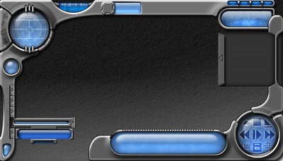
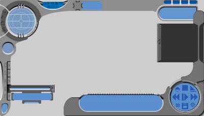 Now, here is the same image with the LayerStyles activated and finalized (step 3 of the graphic design):
 The NEW Singularity In the previous blog I outlined the goals of the revised theme. Specifically, a more rounded/organic shaping of the theme was desired. Here's my mockup in Photoshop, showing the shapes that will become the theme:
 Now here's a preview of the new design, showing the upper-left control cluster and the new popup-menu:
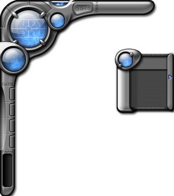 As you can see, the general form and style of the theme are all still there. The graphics have changed slightly, as my skills have (hopefully) improved from where they were 4 years ago.
Making the Graphics: Rounding Technique
Now, let's see in more detail how this is done. We'll go over Steps 1 and 2 for the time being, and I'll try to pick up more on the LayerStyles (Step 3) for the next blog.
In Adobe Photoshop I created a file 500 pixels by 500 pixels with a transparent background. The first (and only) layer was then filled in with a uniform grey, although any color will suffice. The Circular Marquee Tool was then selected with the following parameters: Mode: Fixed, Width: 80px, Height: 80px. On a new layer (Ctrl+Shift+N) I made the selection and then filled it in with a blue color. This shape was then moved to the upper left of the image, equidistant from both the top and left edges of the image. Yup, you guessed right: it will be the big-blue orb characteristic of the theme:

In advance, I know that this theme will have elements designed that may go beyond the edge of the Photoshop image. when Photoshop tries to process LayerStyles on layers that lay on the border of the image, wierd things can happen (especially with bevels). To compensate for this, I'll often create a total-image border that will represent the actual screen-edge for the finished theme graphics. On a new layer I created a 40px border around the entire image using the Rectangular Marquee Tool.
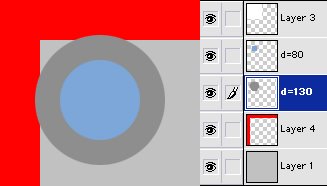
 What would Singularity be without some cool looking metal? Let's start making it by first creating a circular area on a new layer that's 130px by 130 px and filling it with a medium-grey color:
 Now the circle that will be metal should be moved underneath the blue orb layer, and centered
 relative to the blue orb layer.
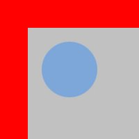
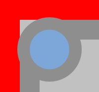
Now that the metal circle is centered to the blue orb and behind it, the metallic shape is expanded. You could use marquee selection tools for this, but I just used a brush set on pencil mode and boosted up the thickness to around 20-30 pixels. Then I started from the top center of the metal ring and drew out to the right of it, or down from it, both lines drawn flush to the artificial screen-edge (the red part).
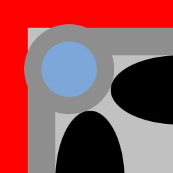
To round this shape off I used some oval selections, sized either 200x100 pixels, or 100x200 pixels. In the below image, the selection areas are simple shown as black ovals. These selections were positioned to that one edge butts up against the lines we created in the last step, while one of the pointed ends touches the metallic-grey shapes.
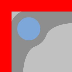
The selection area is reversed (Ctrl+Shift+I) so that everything outside our ovals is selected. Then using another pencil/brush tool, I stroked in the empty area on the metal layer to round out the shape:
Next blog will likely be on the use of LayerStyles. Below is a test-render of the image applying some of my favorite LayerStyles. LayerStyles are so effective because they simply change the effect of a shape in real-time, permitting fine-tuning. They're also non-destructive, and may be turned off at any point or deleted without effecting the actual layer contents.

- Circular and Rectangular Marquee tools were used to create blocky grey shapes in Adobe Photoshop.
- The blocky shapes were then refined by using circular selection tools and the erase tool to round edges.
- Once the shapes were settled upon, the layer-styles were applied and successively refined.
Note: There are quite a few overlapping shapes that are exactly the same color, so some theme elements aren't visible here, but will be when the LayerStyles are applied:
 Now, here is the same image with the LayerStyles activated and finalized (step 3 of the graphic design):
 The NEW Singularity In the previous blog I outlined the goals of the revised theme. Specifically, a more rounded/organic shaping of the theme was desired. Here's my mockup in Photoshop, showing the shapes that will become the theme:
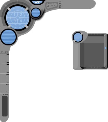 Now here's a preview of the new design, showing the upper-left control cluster and the new popup-menu:
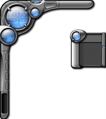 As you can see, the general form and style of the theme are all still there. The graphics have changed slightly, as my skills have (hopefully) improved from where they were 4 years ago.
Making the Graphics: Rounding Technique
Now, let's see in more detail how this is done. We'll go over Steps 1 and 2 for the time being, and I'll try to pick up more on the LayerStyles (Step 3) for the next blog.
In Adobe Photoshop I created a file 500 pixels by 500 pixels with a transparent background. The first (and only) layer was then filled in with a uniform grey, although any color will suffice. The Circular Marquee Tool was then selected with the following parameters: Mode: Fixed, Width: 80px, Height: 80px. On a new layer (Ctrl+Shift+N) I made the selection and then filled it in with a blue color. This shape was then moved to the upper left of the image, equidistant from both the top and left edges of the image. Yup, you guessed right: it will be the big-blue orb characteristic of the theme:

In advance, I know that this theme will have elements designed that may go beyond the edge of the Photoshop image. when Photoshop tries to process LayerStyles on layers that lay on the border of the image, wierd things can happen (especially with bevels). To compensate for this, I'll often create a total-image border that will represent the actual screen-edge for the finished theme graphics. On a new layer I created a 40px border around the entire image using the Rectangular Marquee Tool.
 What would Singularity be without some cool looking metal? Let's start making it by first creating a circular area on a new layer that's 130px by 130 px and filling it with a medium-grey color:
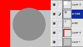 Now the circle that will be metal should be moved underneath the blue orb layer, and centered


posted by mrbiotech at
7:13 AM
![]()


0 Comments:
Post a Comment
<< Home