Singularity: Starting to code
Starting some coding Now that some of the graphics have been generated, I want to try 'em out. This means starting the coding of the OTS2 compliant theme. Approaching it from scratch, I layed out the following directory structure in my ''litestep\profiles\shelltest\themes'' folder:
OTSMajorVersion 2 OTSMinorVersion 0 ThemeName "Singularity v0.004" ThemeAuthor "mrbiotech" ConfigDir "$ThemeDir$config\" LSImageFolder "$ThemeDir$images\"
We're essentially setting LiteStep variables here. The variable name is on the left, while the contents are on the right. Spaces and tabs between the variable and its data don't matter.
The first two, OTSMajorVersion and OTS2MinorVersion help LiteStep know that the theme should be OTS2 compatible. The next two provide information onwho the author is, what the name of the theme is. The last two define the location of the folders created earlier ConfigDir and LSImageFolder. The variables come in quite handy, as they will eliminate the need to continually rewrite entire paths to configuration and graphic files needed by the theme. You'll notice that the last two pieces of data actually contain a LiteStep variable themselves (the $ThemeDir variable, which defines the SingularityV0.004 folder).
After this are three statements to include outside files that will be created later:
include "$ConfigDir$qlpopup.rc" include "$ConfigDir$popuptheme.rc" include "$ConfigDir$popup-$popupStyle$.rc"
The first will load any settings present in a file called qlpopup.rc that will be created in the theme's config folder, containing settings pertaining to a quicklaunch menu The other two will load settings pertaining to the theme's configuration popup-menu, and a theme-style specific menu configuration (this theme may have more than one style of menu).
After this, it's time to load a module. I think the bare minimum modules that any theme should include are a popup-menu module and a desktop module to activate the popup-menu. I've been dying to try Andymon's xPopup and already am fond of the jdesk module, so here's the code to get them loaded at theme startup:
*NetLoadModule jdesk-0.73 *NetLoadModule xpopup-1.1.9
Configuring jDesk Luckily, the OTS2 setup centralizes some of the Jdesk settings to the user's personal.rc folder. This means that all we really need to configure for this module is the size of the desktop that applications can take up. From the graphics I made for the theme I have an idea that the taskbar at the screen top will be about 30 pixels high, and the vertical system tray at the screen's left will be about 30 pixels wide. I'd like at least the taskbar visible at all times meaning the screen area will be 30 pixels shorter on top. If I want both the Tray and the Taskbar visible at all times, I'll need to reduce the area of the screen useable by applications by 30 pixels from the left side as well.
Here are the entries in the theme.rc file:
;----[ jDesk ]---- jDeskWorkArea "30,30,0, 0" *jDeskMButton3 [.none;!popupql;!none;!none]
The first line is simply a comment, a title to let me know what configuration this section is for. The next button instructs the jDesk module to leave 30 pixels of space on the left and top of the screen for the tray and taskbar. Maximized applications will not move into those territories. The last line is something I added for testing purposes, allowing me to test a second popup-menu type devoted directly to quicklaunch items that will be accessible by middle-clicking the desktop.
Configuring xPopup Let the fun begin: This is where I apply the theme's first graphic. The xPopup module functions quite a bit differently than earlier popup modules. It permits full Alpha-Transparency, meaning I can create a popup with Anti-Aliased edges and drop shadows. It also can use just a single graphic and stretch or tile it. Here's are two Photoshop mockup of what I want the popup to look like:
 The top one was my first idea, and I actually implemented all the code on it before realizing the design sucked. The second was the one I settled on, and the one I'll show the code for. Both will actually be included in the theme, for user preference.
Here's the xPopup configuration code for the second popup prototype:
;----[ xpopup ]----
; These settings are in the POPUP-V.RC and POPUP-H.RC files in $configdir$
xpopupcompatibilitymode
xpopupAutoMenuBreak true
xpopupmoveable
xPopupFolderOpenDelay 150
xPopupAlphaMap
xPopupBalloonTip true
xPopupTooltipDurations 200 1000
xPopupAutoMenuBreak
xPopupEnableDragnDrop
xPopupShadeable
xPopupCloseAfterAction
qlAddToGroup ""
qlAlphaMap
qlQuickLaunchMode .horizontal
qlEntryUseBigIcon
qlEntryIconSize 32
qlQuickLaunchItemSize 64
qlQuickLaunchOpenTo .right
qlQuickLaunchWrapCount 10
qlImage $LSImageFolder$qlbg.png
qlActiveEntryImage $LSImageFolder$qlactive.png
qlEntryIconX 16
qlImageMode tile
qlImageLeftEdge 16
qlImageRightEdge 16
qlImageTopEdge 26
qlImageBottomEdge 26
qlActiveEntryImageMode tile-horizontal
qlActiveEntryImageLeftEdge 22
qlActiveEntryImageRightEdge 22
qlOverlapY 10
qlBalloonTooltip true
qlTooltipMode .all
This contains some of the general module parameters at the top and then the definition of the quicklaunch test popup. (Note: I'm still experimenting at this point, so although the quicklaunch is implemented here using graphics from another one of my themes, it will change significantly. The location of the quicklaunch configuration will also likely be moved to an external file).
Inside the config folder of the theme I created a new file called popup-1.rc. This contains the configuration parameters for the second (preferred) popup prototype, which I show below:
;-----[ xPopup settings for popup style 2 ]-----
xPopupImage $LSImageFolder$popupbg-v.png
;xPopupActiveEntryImage $LSImageFolder$popup_a2.png
;xPopupSeparatorImage $LSImageFolder$popup_sep.png
;xPopupImageTrueTransparent false
xPopupImageMode tile
xPopupImageTopEdge 54
xPopupImageBottomEdge 26
xPopupImageLeftEdge 68
xPopupImageRightEdge 26
;xPopupActiveEntryImageMode tile
;xPopupActiveEntryImageLeftEdge 22
;xPopupActiveEntryImageRightEdge 22
;xPopupActiveEntryImageTopEdge 0
;xPopupActiveEntryImageBottomEdge 0
;xPopupSeparatorImageMode tile-horizontal
;xPopupSeparatorImageLeftEdge 30
;xPopupSeparatorImageRightEdge 30
xPopupTitleHeight 54
xPopupTitleFont "Tahoma"
xPopupTitleFontColor c1c1c1
xPopupTitleFontHeight 16
xPopupTitleFontLeftBorder 45
xPopupTitleFontRightBorder 25
xPopupTitleFontTopBorder 14
xPopupTitleFontBottomBorder 5
xPopupTitleFontAlign center
;xPopupTitleFontOutline
;xPopupTitleFontOutline Color ffffff
xPopupTitleFontShadow
xPopupTitleFontShadowColor 111111
xPopupTitleFontBold
xPopupEntryFont "Tahoma"
xPopupEntryFontHeight 12
xPopupEntryFontColor c1c1c1
xPopupEntryFontAlign left
;xPopupEntryFontTopBorder 48
;xPopupEntryFontBottomBorder 36
xPopupEntryFontLeftBorder 36
xPopupEntryFontRightBorder 26
xPopupEntryFontShadow true
xPopupEntryFontShadowColor 000000
xPopupEntryFontShadowX 1
xPopupEntryFontShadowY 1
xPopupEntryIconX 10
xPopupActiveEntryFontColor ffffff
xPopupActiveEntryFontAlign left
xPopupActiveEntryFontBold
xPopupActiveEntryShowIcon
xPopupActiveEntryFontOutline true
xPopupActiveEntryFontOutline Color 333333
xPopupActiveEntryIconSize 24
xPopupFolderShowIcon
;xPopupOverlapX 0
xPopupEntryHeight 20
xPopupActiveEntryHeight 20
xPopupFolderHeight 20
xPopupActiveFolderHeight 20
xPopupMaxWidth 500
xPopupMinWidth 140
xPopupTopBorder 50
xPopupBottomBorder 28
;xPopupLeftBorder 50
;xPopupRightBorder 12
;xPopupAlphaFade
;xPopupCustomAlphaFade 20 20
xPopupArrowImage $LSImageFolder$popupfolder.png
xPopupArrowOffset 9
xPopupArrowOnLeft false
xPopupActiveArrowImage $LSImageFolder$popupfolderactive.png
;xPopupActiveArrowOffset 6
;xPopupArrowOnLeft false
You'll see that there are a lot of commented lines (nonfunctional lines preceded by ";"). I tend to throw in more options than are necessary at the beginning, using a template file that contains ALL the configuration parameters for a given module. Then later I can delete what I don't need. The code as it stands here is capable of rendering the popup the way I want, so the commented lines will probably get the axe soon.
There is also a similar configuration file called popup-2.rc which contains the parameters and definitions required for the initial popup design, should the user select them.
Conclusion
Something that's very difficult to capture in a blog is the trial-and-error nature of this. To get to the settings you see above took about 2 days of tweaking, changing single parameters and recycling the theme to see what the end effect is. After about 100 recycles, it ended up the way I wanted, at least for now. I suppose I could have been more organized in the Photoshop mockup, measuring out exactly where I wanted the text and icons to sit, but it seemed like too much trouble. In 20/20 hindsight, however... Oh well.
At least there's a working popup.
Next time I'll make a system tray and a basic taskbar.
- Folder: SingularityV0.004
- Folder: images
- Folder: config
- New Text File: ''theme.rc''
- Copied File: ''Singularity-ReadMe.txt''
OTSMajorVersion 2 OTSMinorVersion 0 ThemeName "Singularity v0.004" ThemeAuthor "mrbiotech" ConfigDir "$ThemeDir$config\" LSImageFolder "$ThemeDir$images\"
We're essentially setting LiteStep variables here. The variable name is on the left, while the contents are on the right. Spaces and tabs between the variable and its data don't matter.
The first two, OTSMajorVersion and OTS2MinorVersion help LiteStep know that the theme should be OTS2 compatible. The next two provide information onwho the author is, what the name of the theme is. The last two define the location of the folders created earlier ConfigDir and LSImageFolder. The variables come in quite handy, as they will eliminate the need to continually rewrite entire paths to configuration and graphic files needed by the theme. You'll notice that the last two pieces of data actually contain a LiteStep variable themselves (the $ThemeDir variable, which defines the SingularityV0.004 folder).
After this are three statements to include outside files that will be created later:
include "$ConfigDir$qlpopup.rc" include "$ConfigDir$popuptheme.rc" include "$ConfigDir$popup-$popupStyle$.rc"
The first will load any settings present in a file called qlpopup.rc that will be created in the theme's config folder, containing settings pertaining to a quicklaunch menu The other two will load settings pertaining to the theme's configuration popup-menu, and a theme-style specific menu configuration (this theme may have more than one style of menu).
After this, it's time to load a module. I think the bare minimum modules that any theme should include are a popup-menu module and a desktop module to activate the popup-menu. I've been dying to try Andymon's xPopup and already am fond of the jdesk module, so here's the code to get them loaded at theme startup:
*NetLoadModule jdesk-0.73 *NetLoadModule xpopup-1.1.9
Configuring jDesk Luckily, the OTS2 setup centralizes some of the Jdesk settings to the user's personal.rc folder. This means that all we really need to configure for this module is the size of the desktop that applications can take up. From the graphics I made for the theme I have an idea that the taskbar at the screen top will be about 30 pixels high, and the vertical system tray at the screen's left will be about 30 pixels wide. I'd like at least the taskbar visible at all times meaning the screen area will be 30 pixels shorter on top. If I want both the Tray and the Taskbar visible at all times, I'll need to reduce the area of the screen useable by applications by 30 pixels from the left side as well.
Here are the entries in the theme.rc file:
;----[ jDesk ]---- jDeskWorkArea "30,30,0, 0" *jDeskMButton3 [.none;!popupql;!none;!none]
The first line is simply a comment, a title to let me know what configuration this section is for. The next button instructs the jDesk module to leave 30 pixels of space on the left and top of the screen for the tray and taskbar. Maximized applications will not move into those territories. The last line is something I added for testing purposes, allowing me to test a second popup-menu type devoted directly to quicklaunch items that will be accessible by middle-clicking the desktop.
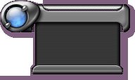
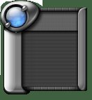
Configuring xPopup Let the fun begin: This is where I apply the theme's first graphic. The xPopup module functions quite a bit differently than earlier popup modules. It permits full Alpha-Transparency, meaning I can create a popup with Anti-Aliased edges and drop shadows. It also can use just a single graphic and stretch or tile it. Here's are two Photoshop mockup of what I want the popup to look like:

 The top one was my first idea, and I actually implemented all the code on it before realizing the design sucked. The second was the one I settled on, and the one I'll show the code for. Both will actually be included in the theme, for user preference.
Here's the xPopup configuration code for the second popup prototype:
;----[ xpopup ]----
; These settings are in the POPUP-V.RC and POPUP-H.RC files in $configdir$
xpopupcompatibilitymode
xpopupAutoMenuBreak true
xpopupmoveable
xPopupFolderOpenDelay 150
xPopupAlphaMap
xPopupBalloonTip true
xPopupTooltipDurations 200 1000
xPopupAutoMenuBreak
xPopupEnableDragnDrop
xPopupShadeable
xPopupCloseAfterAction
qlAddToGroup ""
qlAlphaMap
qlQuickLaunchMode .horizontal
qlEntryUseBigIcon
qlEntryIconSize 32
qlQuickLaunchItemSize 64
qlQuickLaunchOpenTo .right
qlQuickLaunchWrapCount 10
qlImage $LSImageFolder$qlbg.png
qlActiveEntryImage $LSImageFolder$qlactive.png
qlEntryIconX 16
qlImageMode tile
qlImageLeftEdge 16
qlImageRightEdge 16
qlImageTopEdge 26
qlImageBottomEdge 26
qlActiveEntryImageMode tile-horizontal
qlActiveEntryImageLeftEdge 22
qlActiveEntryImageRightEdge 22
qlOverlapY 10
qlBalloonTooltip true
qlTooltipMode .all
This contains some of the general module parameters at the top and then the definition of the quicklaunch test popup. (Note: I'm still experimenting at this point, so although the quicklaunch is implemented here using graphics from another one of my themes, it will change significantly. The location of the quicklaunch configuration will also likely be moved to an external file).
Inside the config folder of the theme I created a new file called popup-1.rc. This contains the configuration parameters for the second (preferred) popup prototype, which I show below:
;-----[ xPopup settings for popup style 2 ]-----
xPopupImage $LSImageFolder$popupbg-v.png
;xPopupActiveEntryImage $LSImageFolder$popup_a2.png
;xPopupSeparatorImage $LSImageFolder$popup_sep.png
;xPopupImageTrueTransparent false
xPopupImageMode tile
xPopupImageTopEdge 54
xPopupImageBottomEdge 26
xPopupImageLeftEdge 68
xPopupImageRightEdge 26
;xPopupActiveEntryImageMode tile
;xPopupActiveEntryImageLeftEdge 22
;xPopupActiveEntryImageRightEdge 22
;xPopupActiveEntryImageTopEdge 0
;xPopupActiveEntryImageBottomEdge 0
;xPopupSeparatorImageMode tile-horizontal
;xPopupSeparatorImageLeftEdge 30
;xPopupSeparatorImageRightEdge 30
xPopupTitleHeight 54
xPopupTitleFont "Tahoma"
xPopupTitleFontColor c1c1c1
xPopupTitleFontHeight 16
xPopupTitleFontLeftBorder 45
xPopupTitleFontRightBorder 25
xPopupTitleFontTopBorder 14
xPopupTitleFontBottomBorder 5
xPopupTitleFontAlign center
;xPopupTitleFontOutline
;xPopupTitleFontOutline Color ffffff
xPopupTitleFontShadow
xPopupTitleFontShadowColor 111111
xPopupTitleFontBold
xPopupEntryFont "Tahoma"
xPopupEntryFontHeight 12
xPopupEntryFontColor c1c1c1
xPopupEntryFontAlign left
;xPopupEntryFontTopBorder 48
;xPopupEntryFontBottomBorder 36
xPopupEntryFontLeftBorder 36
xPopupEntryFontRightBorder 26
xPopupEntryFontShadow true
xPopupEntryFontShadowColor 000000
xPopupEntryFontShadowX 1
xPopupEntryFontShadowY 1
xPopupEntryIconX 10
xPopupActiveEntryFontColor ffffff
xPopupActiveEntryFontAlign left
xPopupActiveEntryFontBold
xPopupActiveEntryShowIcon
xPopupActiveEntryFontOutline true
xPopupActiveEntryFontOutline Color 333333
xPopupActiveEntryIconSize 24
xPopupFolderShowIcon
;xPopupOverlapX 0
xPopupEntryHeight 20
xPopupActiveEntryHeight 20
xPopupFolderHeight 20
xPopupActiveFolderHeight 20
xPopupMaxWidth 500
xPopupMinWidth 140
xPopupTopBorder 50
xPopupBottomBorder 28
;xPopupLeftBorder 50
;xPopupRightBorder 12
;xPopupAlphaFade
;xPopupCustomAlphaFade 20 20
xPopupArrowImage $LSImageFolder$popupfolder.png
xPopupArrowOffset 9
xPopupArrowOnLeft false
xPopupActiveArrowImage $LSImageFolder$popupfolderactive.png
;xPopupActiveArrowOffset 6
;xPopupArrowOnLeft false
You'll see that there are a lot of commented lines (nonfunctional lines preceded by ";"). I tend to throw in more options than are necessary at the beginning, using a template file that contains ALL the configuration parameters for a given module. Then later I can delete what I don't need. The code as it stands here is capable of rendering the popup the way I want, so the commented lines will probably get the axe soon.
There is also a similar configuration file called popup-2.rc which contains the parameters and definitions required for the initial popup design, should the user select them.
Conclusion
Something that's very difficult to capture in a blog is the trial-and-error nature of this. To get to the settings you see above took about 2 days of tweaking, changing single parameters and recycling the theme to see what the end effect is. After about 100 recycles, it ended up the way I wanted, at least for now. I suppose I could have been more organized in the Photoshop mockup, measuring out exactly where I wanted the text and icons to sit, but it seemed like too much trouble. In 20/20 hindsight, however..
At least there's a working popup.
Next time I'll make a system tray and a basic taskbar.
posted by mrbiotech at
8:36 AM


0 Comments:
Post a Comment
<< Home