Back to Singularity
Okay, vacations over. Had some fun with my wife's parents in North Carolina over the holidays. Kids had fun. I had fun. Got the wife a minivan. Back to work harvesting bacterial RNA for a microarray project... and Singularity (Mulestem, I haven't forgotten!)
Two theme-related functions are on my mind: 1) Making the Shortcuts on the left screen edge function, and 2) Making the lower-right media module for the theme. Here's what's going on in these areas:
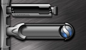
 The Shortcuts section: So the fold-out Command skin for LSXCommand and the icon-ridden xPopup shortcut skin are completed and functional within the theme. The next major thing to address is their activation. Presumably, pressing one of the vertically oriented tabs will open these things. Graphically identifying the function of each tab, however, is proving problematic. The way the graphic design is currently set, there's little room to apply an kind of icon or text to signify what each tab does.
To assist with identification I currently have the tabs partially unfold when the mouse cursor hovers over them. The partially unfolded region could contain either text or a small icon. This leaves the inactive state of each button relatively undiscernable. Any ideas on how to make 'em more recognizable?
The Media Module: The original Singularity theme had a lower-right cornered set of controls for the WinAmp media player. Although a few of the controls were pushable buttons, the bulk of the controls had a digital feel over another blue orb. Long flanges extended from the top and bottom of this region t o provide vertical controls for volume and a horizontal gel area to display the song title, time, and other media information. This time I wanted the media controls to be larger, more visible, and more accessible - but still digital looking. This required a larger control cluster. Here's an early rendering of what the center part of the media pod will resemble.
The area to display song information could be placed to the left, or perhaps shrunk to actually scroll across the sphere itself: either option is possible. Ultimately, I'm trying to make the metal cover open over the eye of it through animation, although the exact method of animation has not been settled upon. (Suggestions for animation scripting welcome).
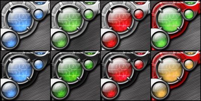
Lastly, I'm still intrigued with color variations for this theme, not just of the blue digital areas, but for the metallic background as well. Applying a red overlay to the metal yielded an interesting japanimation-type feel to the theme, especially when used in conjunction with an orange or greenish coloration to the glass. This tangent originally started when I attempted to make the metal background much lighter and the glass red - to mimic my NonDisjunction suite. The light metal variations turned out quite tasty, as did variations employing a general black overlay. I dunno though: I kind of like 'em all, but it'd be a pain to include each of these variations in the final theme. Any preferences?
Two theme-related functions are on my mind: 1) Making the Shortcuts on the left screen edge function, and 2) Making the lower-right media module for the theme. Here's what's going on in these areas:
 The Shortcuts section: So the fold-out Command skin for LSXCommand and the icon-ridden xPopup shortcut skin are completed and functional within the theme. The next major thing to address is their activation. Presumably, pressing one of the vertically oriented tabs will open these things. Graphically identifying the function of each tab, however, is proving problematic. The way the graphic design is currently set, there's little room to apply an kind of icon or text to signify what each tab does.
To assist with identification I currently have the tabs partially unfold when the mouse cursor hovers over them. The partially unfolded region could contain either text or a small icon. This leaves the inactive state of each button relatively undiscernable. Any ideas on how to make 'em more recognizable?
The Media Module: The original Singularity theme had a lower-right cornered set of controls for the WinAmp media player. Although a few of the controls were pushable buttons, the bulk of the controls had a digital feel over another blue orb. Long flanges extended from the top and bottom of this region t
 o provide vertical controls for volume and a horizontal gel area to display the song title, time, and other media information. This time I wanted the media controls to be larger, more visible, and more accessible - but still digital looking. This required a larger control cluster. Here's an early rendering of what the center part of the media pod will resemble.
The area to display song information could be placed to the left, or perhaps shrunk to actually scroll across the sphere itself: either option is possible. Ultimately, I'm trying to make the metal cover open over the eye of it through animation, although the exact method of animation has not been settled upon. (Suggestions for animation scripting welcome).
Lastly, I'm still intrigued with color variations for this theme, not just of the blue digital areas, but for the metallic background as well. Applying a red overlay to the metal yielded an interesting japanimation-type feel to the theme, especially when used in conjunction with an orange or greenish coloration to the glass. This tangent originally started when I attempted to make the metal background much lighter and the glass red - to mimic my NonDisjunction suite. The light metal variations turned out quite tasty, as did variations employing a general black overlay. I dunno though: I kind of like 'em all, but it'd be a pain to include each of these variations in the final theme. Any preferences?

posted by mrbiotech at
9:42 PM
|
3 comments
![]()


